Mitonet segmentation#
The dataset we will use is https://openorganelle.janelia.org/datasets/jrc_mus-kidney.
We will need to install this empanada-napari plugin https://empanada.readthedocs.io/en/latest/empanada-napari.html.
Setup#
# this cell is required to run these notebooks on Binder. Make sure that you also have a desktop tab open.
import os
if 'BINDER_SERVICE_HOST' in os.environ:
    os.environ['DISPLAY'] = ':1.0'
We need to install some extra libraries and tools for working with remote data and our machine learning tool.
# Install extra libraries for supporting remote Zarr data

!pip install s3fs

!pip install --upgrade urllib3

!pip install empanada-napari

# No problem if you execute it again though, Python will just tell you 'Requirement already satisfied'.
We start by importing napari, our nbscreenshot utility and instantiating an empty viewer.
import zarr
import dask.array as da

import napari
from napari.utils import nbscreenshot

# Create an empty viewer
viewer = napari.Viewer()
Let’s read the metadata from our remote image, an electron microscopy image of mouse kidney from the OpenOrganelle project.
If you are not familiar with zarr or dask that are used here to give us access to the data it’s not a problem. The only thing that you have to know at the moment is that they together provide a way to efficiently store and access images without loading them into memory of your computer. In this way you can get a sneak peek into large datasets.
Click the links if you want to learn more about zarr or dask.
group = zarr.open(zarr.N5FSStore('s3://janelia-cosem-datasets/jrc_mus-kidney/jrc_mus-kidney.n5', anon=True)) # access the root of the n5 container

# Open all resolution levels of the data.
ddata = [
    da.from_zarr(group[f'em/fibsem-uint8/s{i}'])
    for i in range(0, 4)
]
ddata is a list containing data at different resolution levels.
See the shapes of the available stacks:
[a.shape for a in ddata]
Our image is very large and performing a segmentation on the full data would take a long time.
We will crop a 2D slice cropped_img of our image and show how to perform a segmentation on that region.
cropped_img = ddata[0][3000:3400, 800, 5000:6000]

viewer.add_image(cropped_img)
Alternative way of loading a locally downloaded version of the image
Download this image: https://drive.google.com/file/d/1vapS8Ibrm2qQeaNsST1GQ8HQgpHVK-Bq/view?usp=drive_link
Drag and drop this file into napari
Segmentation#
Open the Empanada widget.
from empanada_napari._slice_inference import test_widget

widget = test_widget()

viewer.window.add_dock_widget(widget, name="empanada")
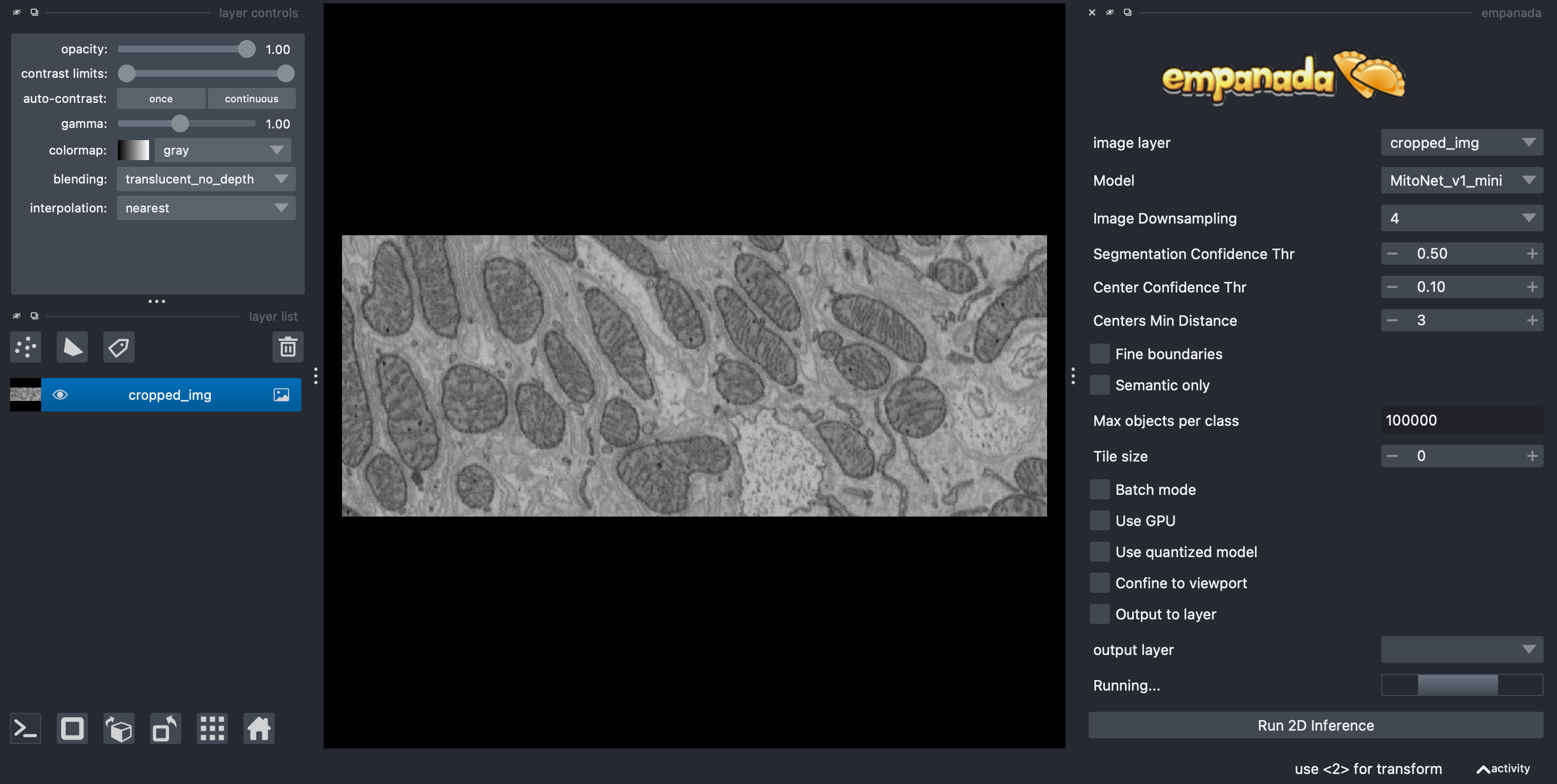
Enter the parameters:
Set
ModeltoMitoNet_v1_miniSet
Image Downscalingto 4 (you can play with this later)Uncheck
Use quantized modelIf you have a NVidia GPU, then you can try to select
Use GPUbut that is not necessary
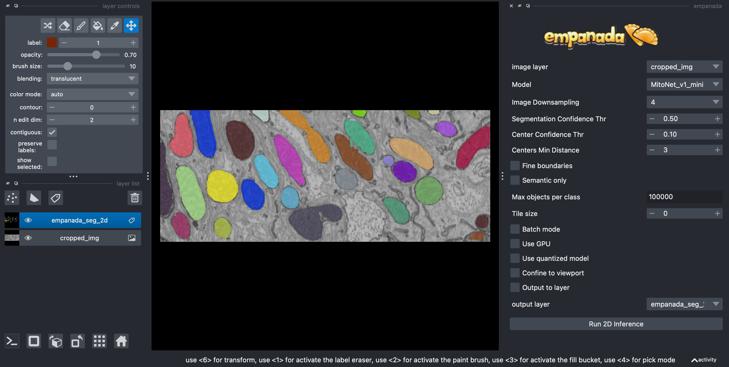
You should get an output like the following:
Note
Click the link to learn more about the great segmentation network Mitonet behind the Empanada plugin.
Quantification#
In this next section, we will compute and display some basic properties of the segmented mitochondria (e.g., area) using scikit-image - an image processing library.
import pandas as pd
import seaborn as sns
from skimage.measure import regionprops_table
We will then use pandas data frame (think - a table of data) to collect our measurements and seaborn - a plotting library to turn them into graphs.
Empanada outputs the segmentation masks as a label image in a Labels layer
called 'empanada_seg_2d'.
In napari, we can access the layer object from the layer list by its name
(viewer.layers['empanada_seg_2d']) and then we can get access to the layer data (in our case - segmented mask) by asking
for data property.
label_layer = viewer.layers['empanada_seg_2d']
mito_labels = label_layer.data
We can use the scikit-image
regionprops_table
function to measure the area and perimeter of the detected mitochondria (and many other parameters too - check documentation for details).
regionprops_table outputs a dictionary where each key is a name of a
measurement (e.g., 'area') and the value is the value of this parameter for each
detected object (mitochondrion in our case).
rp_dict = regionprops_table(
    mito_labels,
    properties=('label','area', 'perimeter')
)
You can look inside this dictionary:
rp_dict
Note
Note that the labels in the above dictionary correspond to the labels in napari - hover with your mouse over objects to see their labels in the left bottom corner.
Let’s put this data in a data frame and display the first few rows:
df = pd.DataFrame(rp_dict)
df.head()
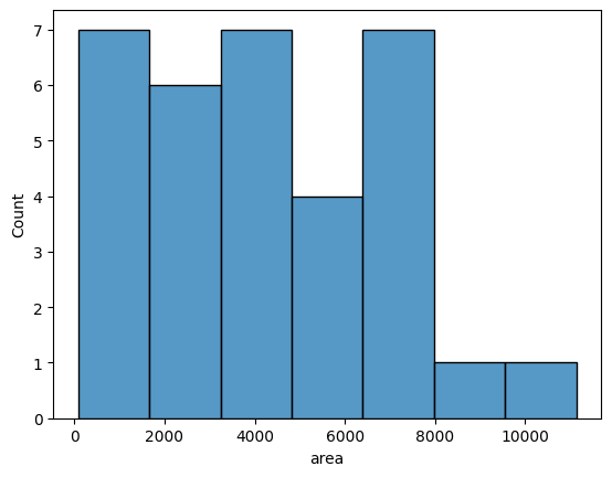
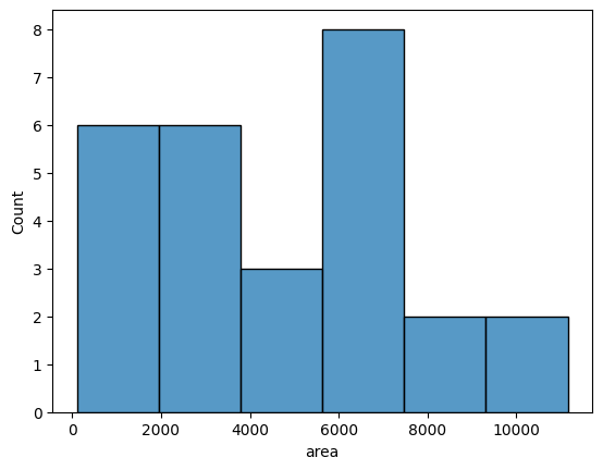
Data frames are a very convenient input to create graphs with a seaborn library. Here you can see an example histogram showing the distribution of mitochondria area:
sns.histplot(data=df,x='area')
Removing border objects#
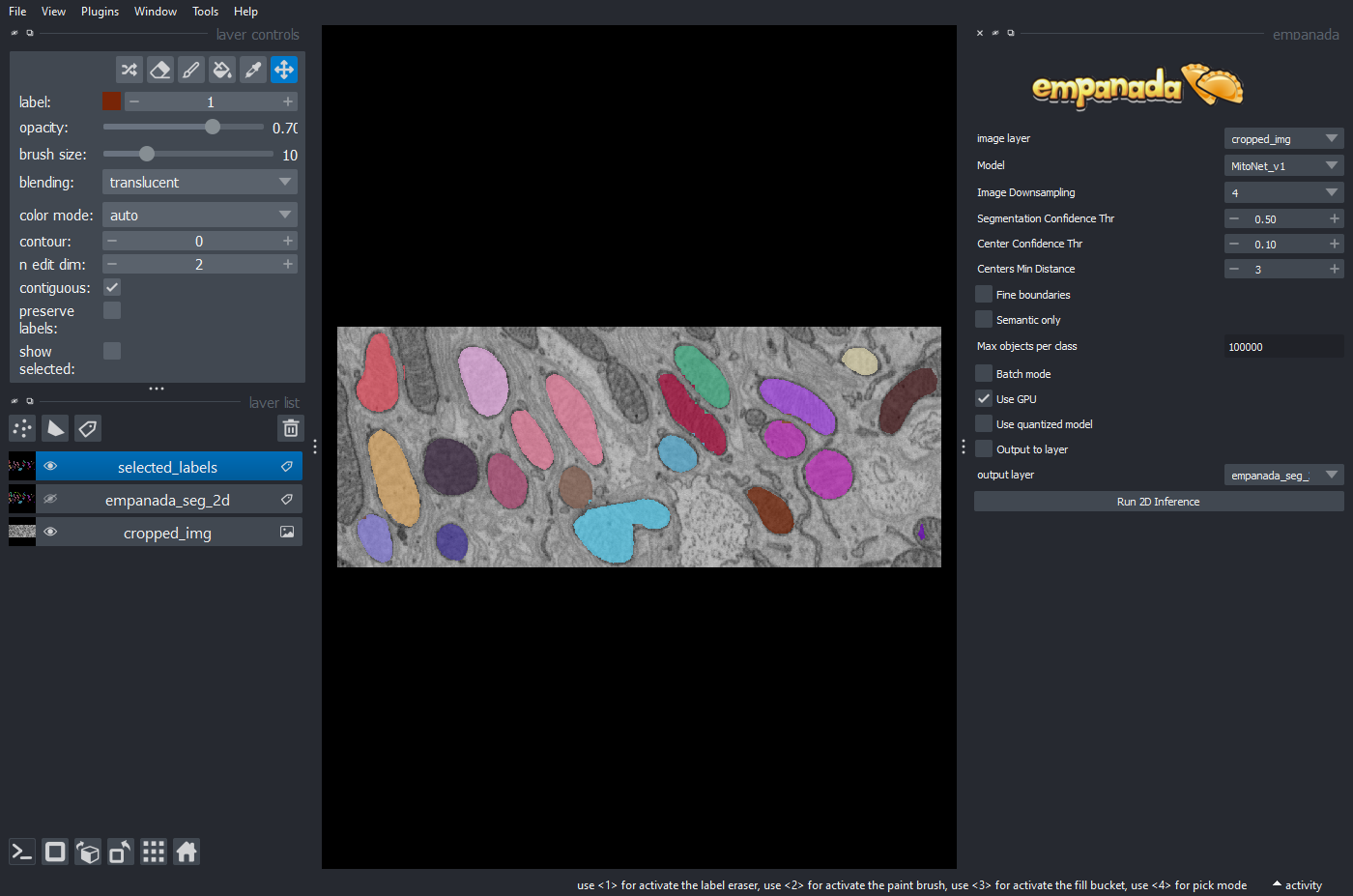
You might have noticed that some detected mitochondria are at the edges of the image and only partially visible. They should not be included in the quantification of the area. You can remove objects touching image borders with clear_border function from scikit-image:
from skimage.segmentation import clear_border

selected_labels = clear_border(mito_labels)
To see the results of the above operation send it back to napari:
viewer.add_labels(selected_labels)

# you can automatically made the original labels invisible
viewer.layers['empanada_seg_2d'].visible=False
You should get an output like the following:
Now, you can repeat the quantification and visualization of regions:
# measurement
rp_dict_sel = regionprops_table(
    mito_labels,
    properties=('label','area', 'perimeter')
)

# results to data frame
df_sel = pd.DataFrame(rp_dict_sel)

# plotting
sns.histplot(data=df_sel,x='area')
Conclusions#
In this notebook we’ve seen how to use napari plugin Empanada to automatically segment mitochondria
We’ve also learnt how to quantify simple properties of detected objects and display these results in a form of a graph in Jupyter Notebook.
The next lessons will show you how to create simple animations of your data using napari.